


Ranking Every Celtics City Edition Uniform
Since first introduced in 2017, the NBA city edition uniforms have become an annual tradition. The uniforms were designed to reflect the unique history of each NBA city while also connecting on a more personal level with fans. Over the last several seasons they have been a major hit, increasing merchandise sales league wide and giving fans something to look forward to each offseason. Today I will be ranking every City Edition uniform worn by the Boston Celtics.
Before I jump into the list it is important to note that this is all opinion based. I may love a specific uniform that you hate, while I may hate one that you love. The best way to look at this list may be as an overview of every Celtics uniform, just presented in my personal favorite order.
I think it is also important to note that I am not from Boston. Sure, I am as big a Celtics fan as you will ever come across, but the whole purpose of the City Edition uniforms is to connect the team with their city. So there may be certain aspects of these uniforms that someone from Boston may appreciate more than myself.
With that out of the way, let's jump into the rankings.
6. 2020/21: Banner Uniform
It may be a bit controversial to put the banner style uniform in last place because we all know how important the banners are to the Celtics organization, in fact they’re everything. But from a uniform perspective I thought they were a bit too basic for my liking. I don’t like all of the lettering on the front of the jersey, it looks crowded and out of place. The banners look amazing hanging from the rafters, so let’s agree to just leave them up there from now on.
5. 2021/22: NBA 75th anniversary uniform

For the NBA’s 75th anniversary a number of teams decided to do a 1946 inspired design for their city edition uniform and the Celtics were in on the trend. There are several elements of this uniform that I love. Including every retired number in Celtics history on the bottom right corner of the jersey is fantastic. Also paying homage to Red Auerbach by including a smokey look on the shorts striping, a nod to his cigar that he famously lit at the end of each victory, was a fantastic addition.
I love a lot of the subtle details in this uniform, but when it was all pieced together I didn’t love the execution. I understand the use of the 1946 Celtics wordmark on the chest, but I personally don't love how it looks. This isn’t a bad unifrom by any means, just not one of my favorites.
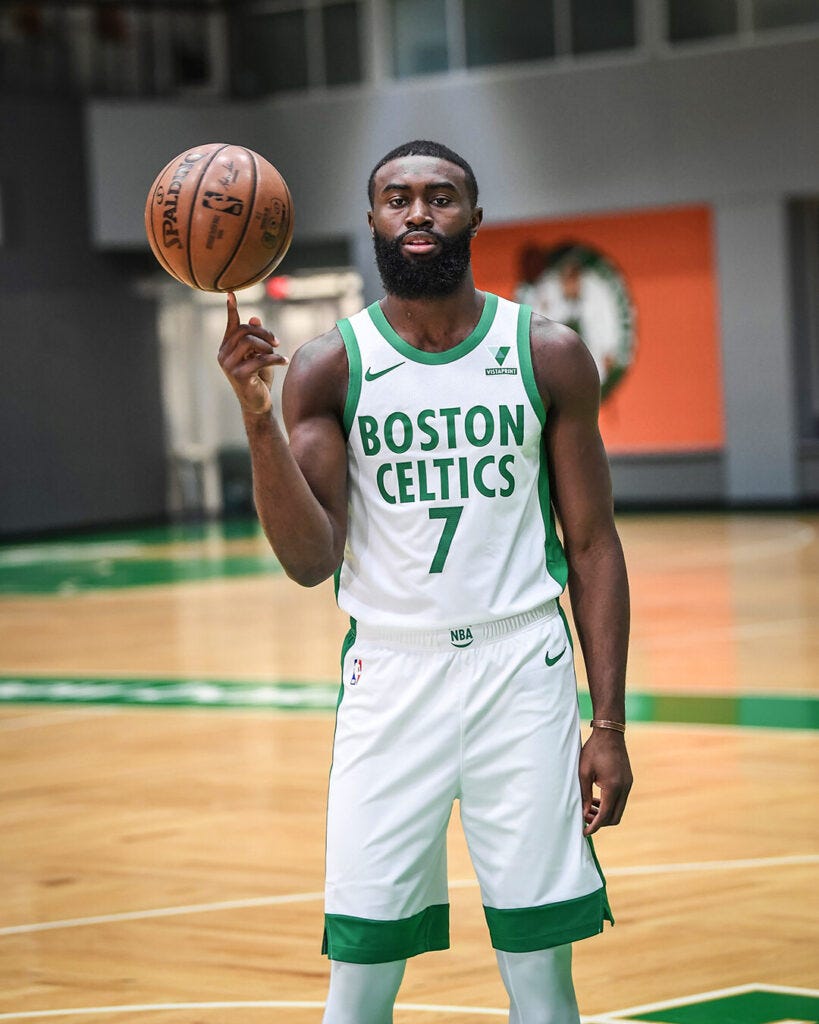
4. 2018/19: White/Green/Yellow Uniform
I wasn’t even sure what to name this uniform because I don't think they followed any particular theme. I actually love this uniform, the yellow outline on what is essentially the standard home white uniform is beautiful. The reason I don't have it ranked higher though is because it doesn’t really feel like a city edition uniform to me. This uniform looks more like an alternate jersey, much like the black, green, and white statement jerseys they wear throughout the season. If I were ranking these with no City Edition context they would be higher, but as they are this is the best I could do.
Side note: These also get unfairly punished in my book because my most vivid memories of this uniform are with Kyrie Irving. Anything that makes me remember Kyrie’s time with the C’s loses points.
3. 2017/18: Gray Parquet
The first ever Celtics city edition uniform came in the form of a gray based uniform featuring a subtle parquet design. I think I liked these uniforms more than most. A lot of Celtics fans were scarred from a gray uniform due to the hideous sleeved uniforms they wore in 2014, but when you separate the two uniforms I actually think the City Edition one is quite nice. I’m a sucker for the parquet, throw that pattern on anything and I’ll be a fan. So I may like these uniforms more than many others, but this is my list so they crack the top-3.
2. 2019/20: Irish Pub Style

If the last one didn't ruffle some feathers then this one certainly will. From the moment these uniforms were released it seemed like people either loved them or hated them, no in between. I happen to fall on the love side of the spectrum. Of the six City Edition uniforms, I feel like this one leaned most heavily into the city of Boston rather than the Celtics franchise.
No large city in the United States has a higher percentage of people claiming Irish ancestry than Boston does, so the “Irish Pub'' style lettering across the front of the jersey was a beautiful touch in my opinion. I also just love the shade of gold used on this uniform. Typically when teams use “gold” it comes off as yellow to me (I’m talking to you Lakers fans), the gold used in this uniform is an actual gold that really pops on the green base. Of the six City Edition jerseys, this is the only one I personally own. Many of you will disagree, and that’s fine, but I think this uniform is spectacular.
1.2022/23: Bill Russell Edition
The most recent City Edition uniform is also the best, and I don’t think it’s much of a debate. Red Auerbach aside, no individual is more responsible for the Boston Celtics being the best franchise in NBA history than Bill Russell. This uniform pays homage to Russell with a “Champions of Gold” theme. It features 11 gold diamonds running down the sides to commemorate the 11 Championships he won with the C’s. It has the number “6” with eleven diamonds encompassed on the front of the shorts in honor of his legendary number 6 that is now retired across the entire NBA. Most importantly, the “Champions of Gold” is an homage to Bill being “The Gold Standard” both on and off the court. He broke barriers as the first black head coach and a member of the first all-black starting five in NBA History, and he was a key contributor in the Civil-Rights movement across the United States.
Bill Russell was a beautiful human, and the Celtics honored that by creating a beautiful uniform in his honor. The City Edition uniform is supposed to be a one year creation, but much like the 11 banners he hung in the Garden and the impact he left around the world, I wouldn’t mind if these lasted forever.
In the future I’d love to see more uniforms inspired by Celtics greats. Who wouldn’t love to see a uniform inspired by legends like Larry Bird, John Havlicek, or Paul Pierce? I’d also love to see them dive more into the city of Boston. There may not be a more historic city in the country than Boston and the Celtics shouldn’t shy away from that.
Either way I look forward to expanding upon this list for years to come. Nothing will ever top the traditional green and white sets they’ve been wearing forever, but the City Edition is a fun way to get creative and think outside of the box. You never know what they’ll come up with next.